March 03, 2021
The power of visualization

by VIKTOR
Download the White Paper and get INSPIRED
Learn about trends in digital transformation and how they affect the engineering and construction industry.
But these opportunities also bring a set of challenges. This is no difference when looking at the Asset Management market. Whether setting up systems to collect data at large scale or implementing algorithms to generate possible outcomes to obtain the optimal result (see VIKTOR as a tool within the Real Estate Development market), to extract understandable insights from the data or results remains a great challenge.
A world of opportunities
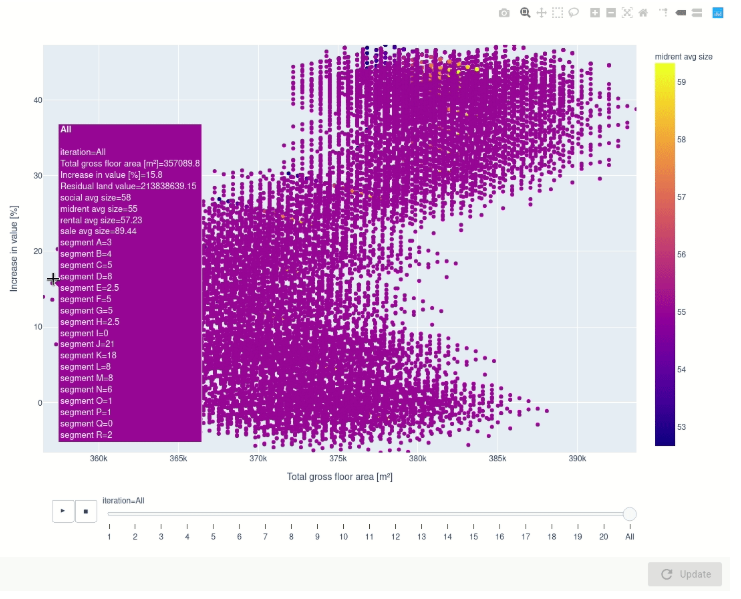
One of the best ways to understand results is by means of visualizations. As was mentioned by Bang Wong, creative director of MIT’s Broad Institute, in this article, plotting data allows the observer to see the underlying structure of the data that you wouldn’t otherwise see if you’re looking at a table. The results that are produced from data processing or algorithmic optimization therefore never reach their full potential if it is not presented well to the decision maker. There is a general belief that the visualization of data is limited to three or four dimensions if one wants to get an intuitive understanding of the results, and that these results become less intuitive the more dimensions are added. This, to a certain exten,t is true, but it is with the assumption that visualizations are static. When these visualizations respond to interactions by the user, that is when a world of opportunities truely opens up.
Open-source developments have also made it easier for anyone to render these dynamic visualizations in a short period of time, such as the Python packages Plotly, Pygal and mpld3, just to name a few. Users of VIKTOR are taking advantage of these available tools to gain this extra insight in data obtained.
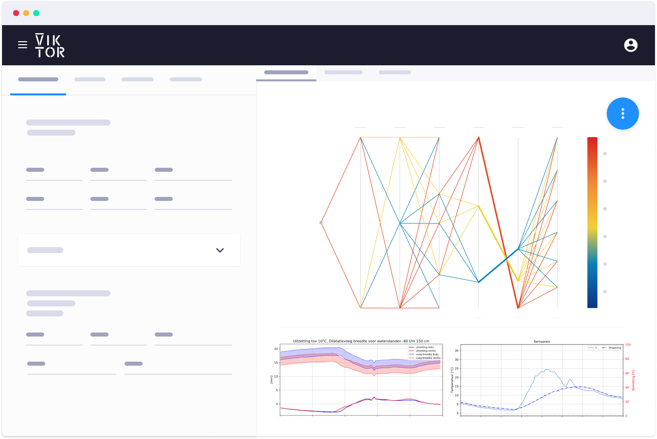
On the VIKTOR platform, you can integrate with different software programs to create your own customizable dashboard. Here, you can decide for yourself which results you want to see presented in what kind of (interactive) graphical manner for useful insights. Based on these visualizations, data-driven decision-making gets to a whole new level!
Read more about dashboarding and data-driven decision-making with VIKTOR.
Visualizing for faster decision-making
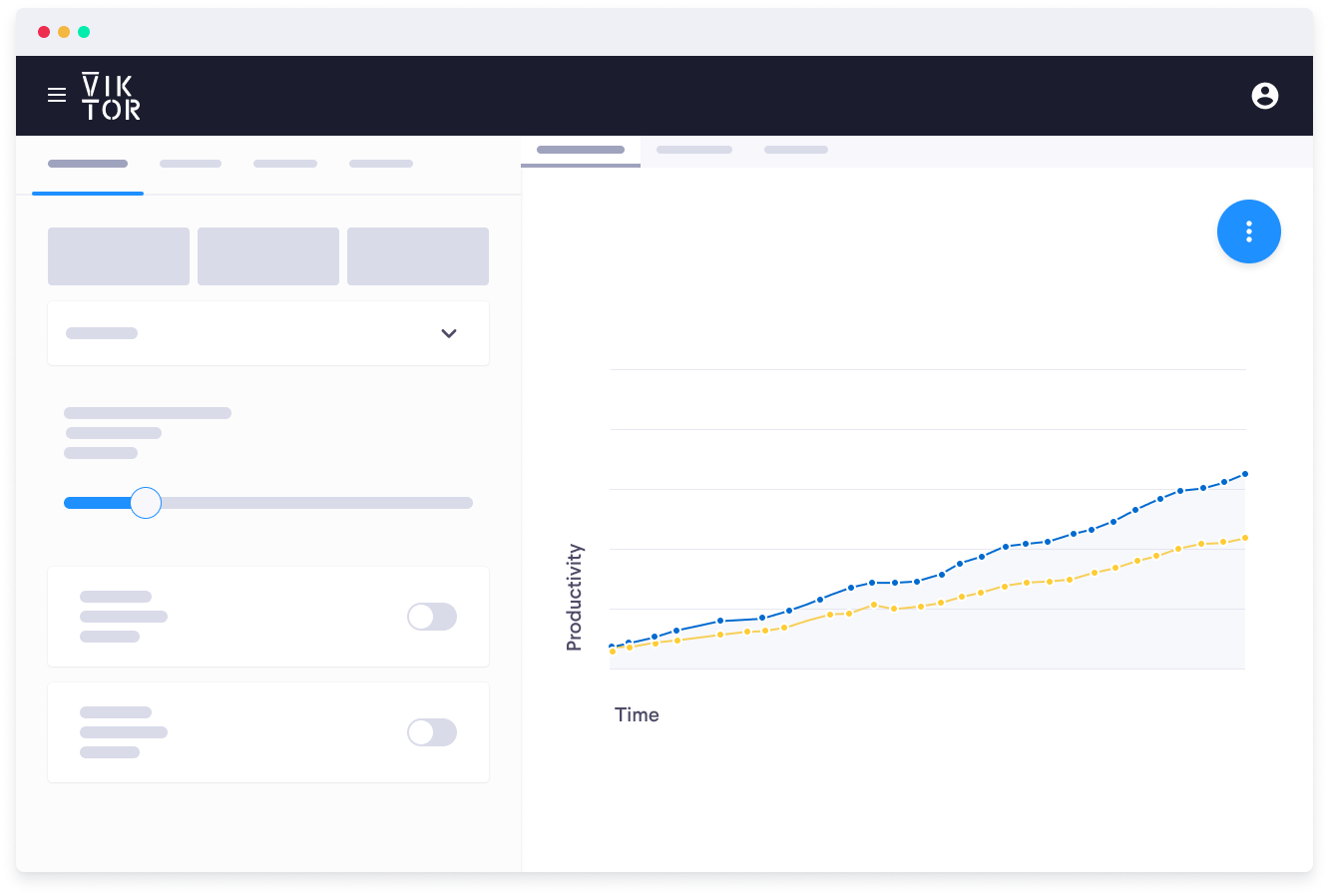
In the video below, data – generated with an optimization that was applied to a project in the real estate development market – is visualized. The dynamic ability of the visualization has given the user an idea on how the optimization behaves and develops through iterations, and also gives insight on other possibilities, if the cost function isn’t a strict requirement. By assigning all other variables of interest to the data points, the user was also able to inspect data points by merely hovering over the data point. The visualization therefore does not only give a better understanding, but also provides the possibility for quicker decision-making.