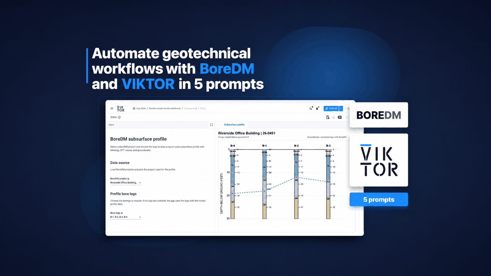

Download the White Paper and get INSPIRED
Learn about trends in digital transformation and how they affect the engineering and construction industry.
With no doubt, Excel is a powerful and well-known software for data visualisation. Though, PLAXIS does not provide full integration with Excel, making the extraction and visualisation process time-consuming. There are three possible areas of improvement in terms of data visualisation:
-
Combine all data into one worksheet for plotting
-
Automate the process of selecting data series in Excel when creating plots
-
Create plots with customised series names and axis titles
This tutorial aims to extend the lesson learnt from the 2nd tutorial. We will extract output from multiple phases and use plots to compare the results. This can be done with the following four steps:
-
Install external module to PLAXIS environment
-
Extract results for multiple phases
-
Compare results at different phases using plots in Excel
-
Formatting with Openpyxl
As before, this tutorial requires the readers have VS Code and PLAXIS environment installed. Follow the instructions from the article below if you're new to this page. Let's get started!
PLAXIS example model
We will use the same PLAXIS 2D model from 2nd tutorial. Follow the instructions below to set up and calculate the model if you haven't done so.
LINK To SECOND TUTORIAL
Similar to the last tutorial, we will open the PLAXIS file using "open_output.py" such that the API server can be enabled.
As a recap, we use the following code to open the file:
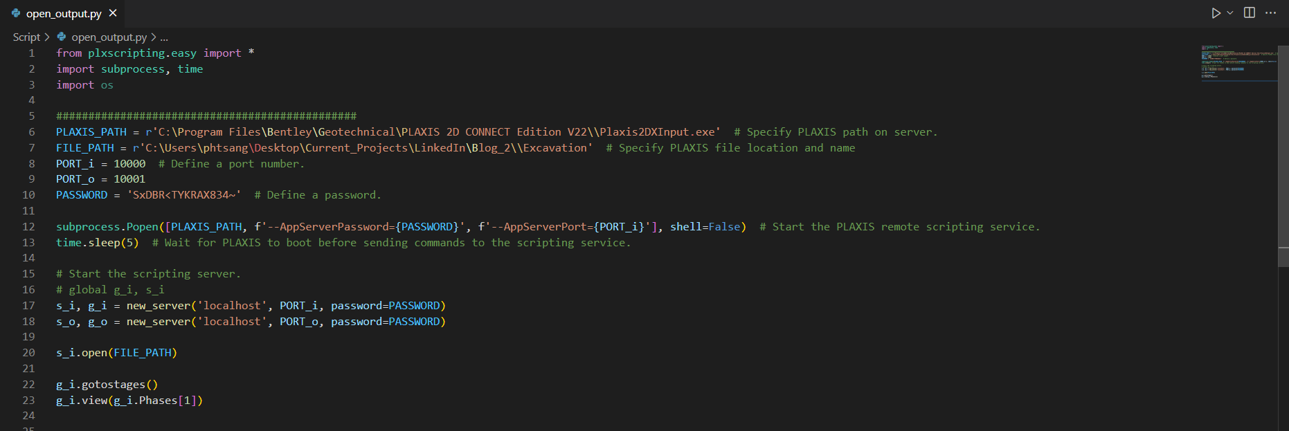
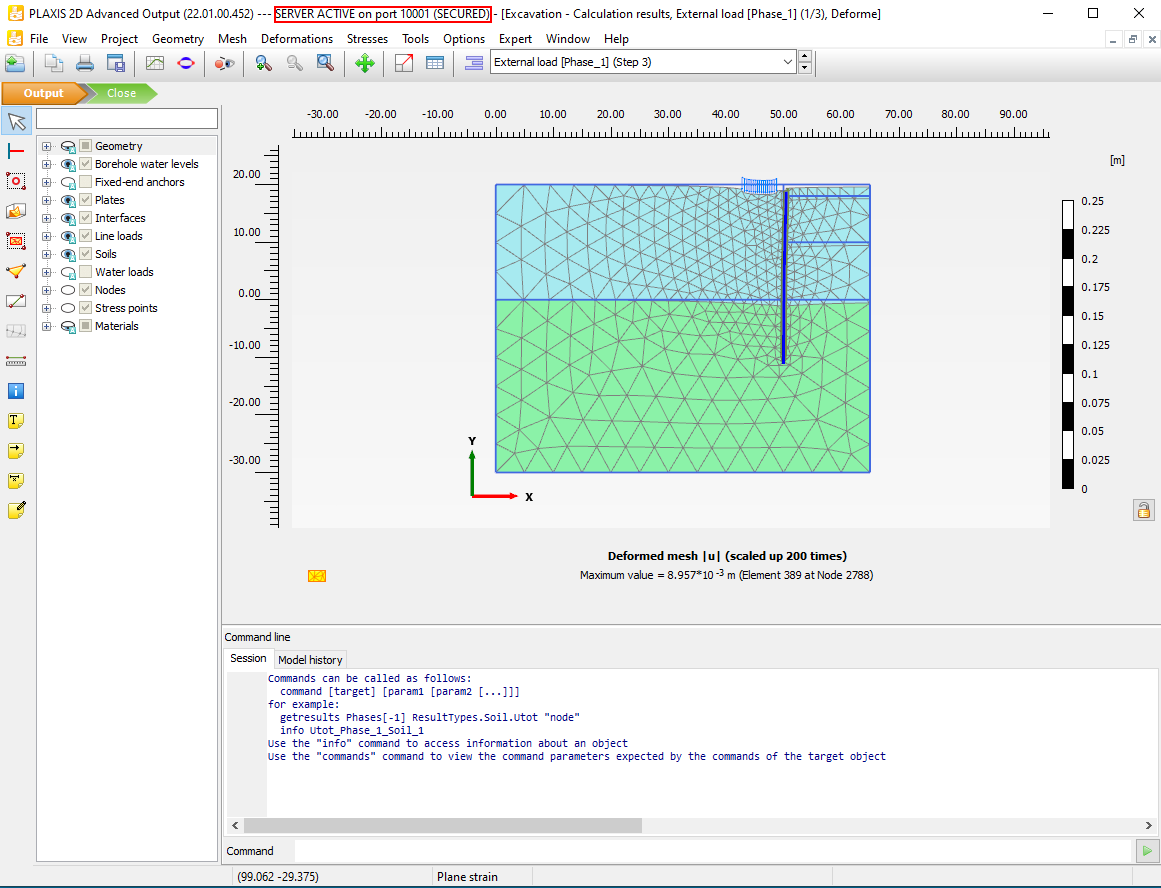
After running the code above, both PLAXIS 2D input and output apps should be opened automatically. From the output app, you should see "SERVER ACTIVE on port 10001".
Step 1: Install External Module to PLAXIS Environment
Our goal is to extract results from PLAXIS and create comparison plots in excel. In order to do so, we need three external modules:
- Pandas
- Xlsxwriter
- Openpyxl
The process of installing external modules through PLAXIS command prompt has been described in detail in the 2nd tutorial. Make sure you have gone through the process before proceeding with the following steps.
From the last tutorial, both pandas and xlsxwriter should be installed. Note that Python modules are version sensitive, this is because some modules have connections to other modules and hence version updates may cause malfunctions. This is essential to have consistent module dependencies in the PLAXIS environment.
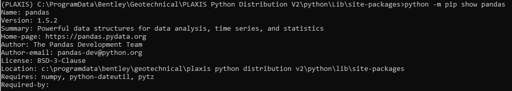
The versions of modules I have used in this tutorial are as follows:
1pandas == 1.5.2
2xlsxwriter == 3.0.3
3openpyxl == 3.0.9
4defusedxml == 0.7.1
To check the current version of module, we can use the following command in the PLAXIS command prompt:
1python -m pip show pandas
If the versions are not consistent, we can use the following command to upgrade/downgrade the version:
1python -m pip install --upgrade pandas==1.5.2
Install the rest of the modules:
1python -m pip install xlsxwriter==3.0.3
2python -m pip install openpyxl==3.0.9
3python -m pip install defusedxml==0.7.1
In some situations, you may encounter an error when installing defusedxml
1ERROR: Could not install packages due to an OSError: [WinError 5] Access is denied
If that's your case, try the following code:
1python -m pip install --upgrade defusedxml==0.7.1 --user
Now that we have installed all the required modules. We can now ready to extract results from different phases in PLAXIS using Python script.
Step 2: Extract Results for Multiple Phases
The main goal of Step 2 is to extract results (Bending moment) from three phases in the 'Excavation' model. We will then export the results to Excel in a worksheet called 'combined_Plate_1' with the columns shown below:

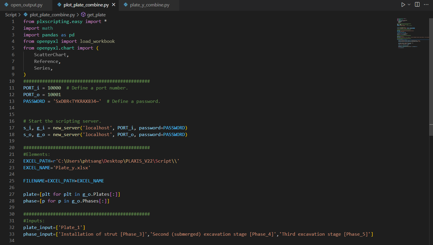
First, we create an empty python file and call it "plot_plate_combine.py".
Import Modules and Start Server
1from plxscripting.easy import *
2import math
3import pandas as pd
4from openpyxl import load_workbook
5from openpyxl.chart import (
6    ScatterChart,
7    Reference,
8    Series,
9)
10###############################################
11PORT_i = 10000  # Define a port number.
12PORT_o = 10001
13PASSWORD = 'SxDBR<TYKRAX834~'  # Define a password.
14
15
16
17# Start the scripting server.
18s_i, g_i = new_server('localhost', PORT_i, password=PASSWORD)
19s_o, g_o = new_server('localhost', PORT_o, password=PASSWORD)
Define File Name
File location: C:\Users\phtsang\Desktop\PLAXIS_V22\Script
File name: can be any name you want
1EXCEL_PATH=r'C:\Users\phtsang\Desktop\PLAXIS_V22\Script\\'
2EXCEL_NAME='Plate_y.xlsx'
3
4
5FILENAME=EXCEL_PATH+EXCEL_NAME
Input Definition
In this case, we will extract the bending moment for 'Plate_1' from the phases below:
- 'Installation of strut [Phase_3]'
- 'Second (submerged) excavation stage [Phase_4]'
- 'Third excavation stage [Phase_5]'
1plate=[plt for plt in g_o.Plates[:]]
2phase=[p for p in g_o.Phases[:]]
3
4
5###############################################
6#Inputs:
7plate_input=['Plate_1']
8phase_input=['Installation of strut [Phase_3]','Second (submerged) excavation stage [Phase_4]','Third excavation stage [Phase_5]']
Your script should look like:
Result extraction
After pre-processing, we will define a function to extract bending moment (a simplified version from last tutorial) and call it "get_plate()". def get_plate(plate_o,phase_o):
1    plateY=g_o.getresults(plate_o,phase_o,g_o.ResultTypes.Plate.Y, "node")
2    plateM=g_o.getresults(plate_o,phase_o,g_o.ResultTypes.Plate.M2D, "node")
3
4
5    phasename=str(phase_o.Identification).split('[')[0]
6    col1='Bending Moment [kNm/m]'+'_'+phasename
7
8
9    results = {'Y': plateY,col1: plateM}
10
11
12    plateresults=pd.DataFrame(results)
13    plateresults = plateresults.sort_values(by=['Y'],ascending=False)
14
15
16    return plateresults
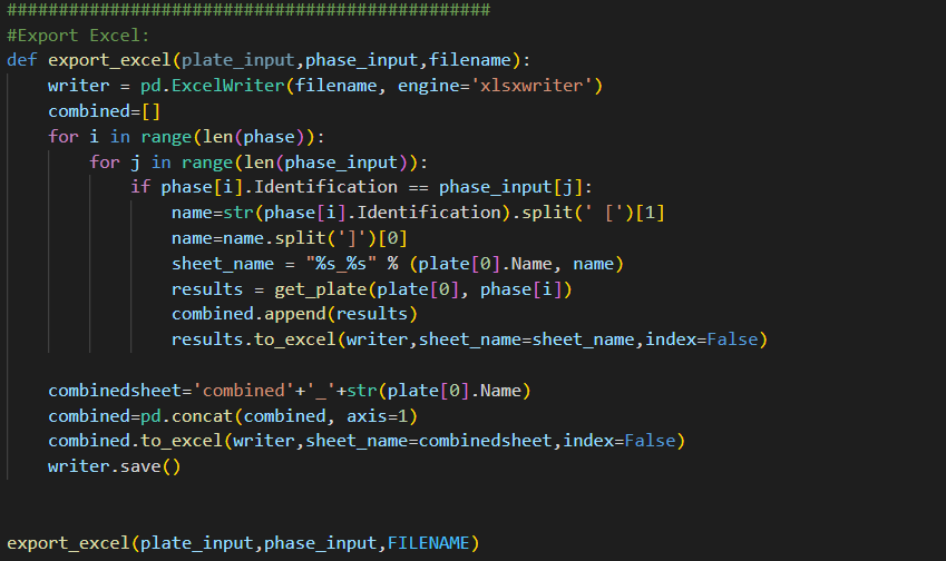
Export to Excel
Unlike last tutorial, we want to extract results from multiple phases instead of a single phase. Hence, the "export_excel()" function needs to be modified. Three actions are involved:
-
Loop through the name of the existing phase from the current model
-
Cross-check with the input of the phase by the user (i.e. Phase 3, 4 and 5).
-
Extract results if they match and export to individual worksheet (e.g. Plate_1_Phase_3)
-
Combine the results into a new Dataframe and export to a worksheet ('combined_Plate_1')
These actions can be done with the following code. Let's break it down!
1def export_excel(plate_input,phase_input,filename):
2    writer = pd.ExcelWriter(filename, engine='xlsxwriter')
3    combined=[]
4    for i in range(len(phase)):
5        for j in range(len(phase_input)):
6            if phase[i].Identification == phase_input[j]:
7                name=str(phase[i].Identification).split(' [')[1]
8                name=name.split(']')[0]
9                sheet_name = "%s_%s" % (plate[0].Name, name)
10                results = get_plate(plate[0], phase[i])
11                combined.append(results)
12                results.to_excel(writer,sheet_name=sheet_name,index=False)
13
14
15    combinedsheet='combined'+'_'+str(plate[0].Name)
16    combined=pd.concat(combined, axis=1)
17    combined.to_excel(writer,sheet_name=combinedsheet,index=False)
18    writer.save()
19
20
21
22export_excel(plate_input,phase_input,FILENAME)-
We need to first define an empty list 'combined=[ ]'. This allows us to append the extracted results at each phase into a single list such that we can concatenate them in the last step.
-
Next step is to loop through the existing phases of the model and see which one matches our input. This is done using PLAXIS command 'phase[i].Identification' which gives the full name of each phase.
1for i in range(len(phase)):
2        for j in range(len(phase_input)):
3            if phase[i].Identification == phase_input[j]:
The following code is for naming purpose. For example, 'phase[0].Identification' will give 'Installation of strut [Phase_3]'. I want to get 'Phase_3' which is sitting between the squared bracket [ ]. Then, I combine 'Plate_1' and 'Phase_3' to form the worksheet name.
1name=str(phase[i].Identification).split(' [')[1]
2name=name.split(']')[0]
3sheet_name = "%s_%s" % (plate[0].Name, name)
- The bending moment of PLate_1 at each phase is extracted using 'get_plate()' function and stored as results. The results are then appended to the 'combined' list through the method 'combined.append(results)'. Finally, use 'results.to_excel(writer,sheet_name=sheet_name,index=False)' to export results at each phase to individual worksheet.
1results = get_plate(plate[0], phase[i])
2combined.append(results)
3results.to_excel(writer,sheet_name=sheet_name,index=False)
- Last four lines aim to combine the results in 'combined' list and export to'combined_Plate_1' worksheet. This is done by pandas's method 'concat()'. It is important to input 'axis=1' as an argument as it tells pandas to combine the results horizontally (by rows). By default, 'axis=0' combines the results vertically (by columns).
1combinedsheet='combined'+'_'+str(plate[0].Name
2combined=pd.concat(combined, axis=1)
3combined.to_excel(writer,sheet_name=combinedsheet,index=False)
4writer.save())
Your final script should look like:
Now that we have extracted results from all phases, we can then proceed with creating plots in Excel using Python.
Start automating your workflows
Step 3: Compare results at different phases using plots in Excel with Openpyxl
Lastly, we will learn about Openpyxl which is a module that allows us to create Excel plot.
We create a function, call it "get_combined_plot()".
- df_inter stores the dataframe obtained from the 'combined_Plate_1'. sheet is where I specify the worksheet 'combined_Plate_1' such that I can create plot there.
1def get_combined_plot(filename,sheetname):
2    df_inter = pd.read_excel(filename, sheet_name = sheetname,engine="openpyxl")
3    wb=load_workbook(filename)
4 sheet=wb[sheetname]-
Then, create a chart object called 'chart1' which is a scatter chart. After that, we assign axis titles using openpyxl methods (x_axis.title and y_axis.title).
-
yvalue stores the Y coordinates of the results using method 'Reference()'.
-
position & prow is where I specify the location of the plot
1chart1=ScatterChart()
2    chart1.x_axis.title = 'Bending Moment (kNm/m)'
3    chart1.y_axis.title = 'RL (m)'
4    chart={'chart1':chart1}
5    yvalue=Reference(sheet,min_col=1,min_row=2,max_row=len(df_inter)+1)
6    position='G'
7    prow=1
-
Then, extract the bending moment values from second column and store them in value.
-
Once we have data for x and y axis, we use 'Series()' to create a series and assign it to 'chart1' using 'chart1.series.append(series)'.
1  if df_inter.columns.values[1].split(' [')[0] == 'Bending Moment'
2        value=Reference(sheet,min_col=2,min_row=2,max_row=len(df_inter)+1)
3        series=Series(yvalue,value,title=list(df_inter.columns.values)[1])
4
5        chart1.series.append(series):
The code below is mainly for formatting which set plot styles such as height, tick box and legend position etc (like typical excel plot setting). More formatting details are outlined in the official documentation: Charts
1   charts='chart1'
2    chart[charts].height=15
3    chart[charts].y_axis.tickLblPos = 'low'
4    chart[charts].legend.position = 'b'
5
6
7    if ord(position)<89 and prow<=2:
8        sheet.add_chart(chart[charts], position+str(1))
9    position=chr(ord(position)+10)
10    prow=prow+1
11    wb.save(filename)
-
The steps above created plot using the first two columns (i.e. 'Y' and 'Bending Moment [kNm/m]_Installation of strut ')
-
Final step is to loop through the rest of the columns and add them as two extra series to the existing plot.
-
In order to identify if the columns contain Y coordinate or Bending moment, we need to use if-else statement.
-
If the column title is 'Y', it will store the column values to yvalue (i.e. y axis). If the column title contains 'Bending Moment', it will store column values to value (i.e. x axis).
1   for i in range(3,len(df_inter.columns)+1):
2        if df_inter.columns.values[i-1].split('.')[0] != 'Y':
3            if df_inter.columns.values[i-1].split(' [')[0] == 'Bending Moment':
4                value=Reference(sheet,min_col=i,min_row=2,max_row=len(df_inter)+1)
5                series=Series(yvalue,value,title=list(df_inter.columns.values)[i-1])
6                chart1.series.append(series)
7        elif df_inter.columns.values[i-1].split('.')[0] == 'Y':
8            yvalue=Reference(sheet,min_col=i,min_row=2,max_row=len(df_inter)+1)
9    wb.save(filename)
The final script is shown below:
1def get_combined_plot(filename,sheetname):
2    df_inter = pd.read_excel(filename, sheet_name = sheetname,engine="openpyxl")
3    wb=load_workbook(filename)
4    sheet=wb[sheetname]
5
6
7    chart1=ScatterChart()
8    chart1.x_axis.title = 'Bending Moment (kNm/m)'
9    chart1.y_axis.title = 'RL (m)'
10    chart={'chart1':chart1}
11    xvalue=Reference(sheet,min_col=1,min_row=2,max_row=len(df_inter)+1)
12    position='G'
13    prow=1
14
15
16    if df_inter.columns.values[1].split(' [')[0] == 'Bending Moment':
17        value=Reference(sheet,min_col=2,min_row=2,max_row=len(df_inter)+1)
18        series=Series(xvalue,value,title=list(df_inter.columns.values)[1])
19
20
21        chart1.series.append(series)
22
23    charts='chart1'
24    chart[charts].height=15
25    chart[charts].y_axis.tickLblPos = 'low'
26    chart[charts].legend.position = 'b'
27
28
29    if ord(position)<89 and prow<=2:
30        sheet.add_chart(chart[charts], position+str(1))
31    position=chr(ord(position)+10)
32    prow=prow+1
33    wb.save(filename)
34
35
36    for i in range(3,len(df_inter.columns)+1):
37        if df_inter.columns.values[i-1].split('.')[0] != 'Y':
38            if df_inter.columns.values[i-1].split(' [')[0] == 'Bending Moment':
39                value=Reference(sheet,min_col=i,min_row=2,max_row=len(df_inter)+1)
40                series=Series(xvalue,value,title=list(df_inter.columns.values)[i-1])
41                chart1.series.append(series)
42        elif df_inter.columns.values[i-1].split('.')[0] == 'Y':
43            xvalue=Reference(sheet,min_col=i,min_row=2,max_row=len(df_inter)+1)
44    wb.save(filename)
45
46
47combinedsheet='combined_Plate_1'
48get_combined_plot(FILENAME,combinedsheet)
Run the script with the following.
1(PLAXIS) C:\Users\phtsang\Desktop\PLAXIS_V22\Script>python plot_plate_combine.py
Now if you open the excel spreadsheet in the location you specified earlier and go to 'combined_Plate_1' worksheet. You can see we have extracted the Y coordinate and Bending moment for all three phases. More importantly, we have a plot that contains all results which allow us to compare the bending moment at different phases!
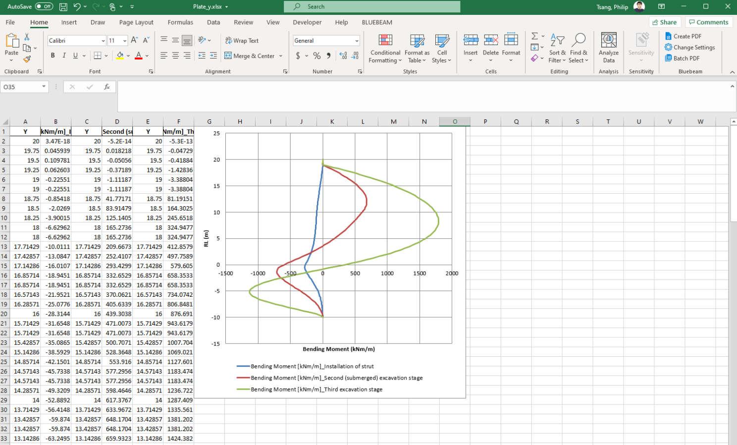
Fantastic! You have successfully extracted results from PLAXIS and used them to create a plot in Excel using Python.
What's next
That's all for the third tutorial on PLAXIS output visualisation using Python. By now, you should be able to extract results at multiple phases and create plots in excel for result comparison. This can be further extended to include multiple structural elements at various stages, which means the whole output extraction process can be automated. I will further talk about this in future tutorials.
Here you can find all tutorials to keep improving your automation skills:
Tutorial 1: Start Using Python to Automate PLAX
Tutorial 2: Extract PLAXIS results automatically using Python
Tutorial 3: PLAXIS result visualization using Python
Tutorial 4: Create a PLAXIS model based on a Excel sheet using Python
If you're interested in hearing more about Python, PLAXIS and workflow automation, feel free to follow my LinkedIn page. You can also support me by following me on Medium where I will provide source code and more general programming techniques in the future.